designing at scale, one token at a time
Varsity Tutors design system
TL;DR
Created a scalable, accessible design system, and a stronger partnership between design and engineering.
Overview
As the Design Manager for Varsity Tutors’ consumer experiences, I led the initiative to modernize and scale our design system, a cross-functional effort spanning multiple product surfaces and design teams.
After leadership called for a refreshed, more visual UI, we realized our existing system wasn’t equipped to support large-scale updates. Components were inconsistent, tokens were incomplete, and engineering handoffs varied by team.
This project became the catalyst for transforming our loosely defined system into a cohesive, scalable design infrastructure, one that not only improved UI consistency but also strengthened collaboration between design and engineering.
The Problem
The existing design system had grown organically, without formal governance or consistent tokenization.
Designers spent too much time styling from scratch or fixing overrides.
Engineers lacked a reliable source of truth, leading to visual drift in production.
Leadership wanted a faster, more polished way to deliver a modernized experience across both the student and tutor verticals.
We needed to rebuild the foundation, creating both a visual language and a scalable process.
My Role
Design Manager, Consumer Experiences
Partnered with product and engineering leads across consumer and tutor verticals.
Mentored and empowered one of my reports to lead the initiative end-to-end, helping her establish process ownership, cross-team alignment, and documentation standards.
Directed visual direction and accessibility standards, ensuring color tokens and typography met WCAG contrast requirements.
Led a lunch-and-learn for engineers on using Figma Dev Mode to bridge the gap between design intent and production accuracy.
The Process
Audit and Alignment
We began with a full audit of the existing system, cataloging every component, variant, and color token in use. We worked across verticals to identify redundancy, inconsistencies, and missing documentation.
Define the Foundations
We rebuilt the core of the system:
A robust token structure for color, typography, and spacing.
Accessible color palettes and modernized themes to meet brand and accessibility goals.
Clean component architecture with clear naming and usage guidance.
Build, Document, and Distribute
We created a central system file and documentation hub, outlining usage rules and accessibility specs.
To ensure scalability, we implemented review checkpoints—every new component required both design and engineering validation before release.
Standardize the Handoff Process
Recognizing gaps in translation between design and production, I worked with engineering to create a new handoff framework:
Defined shared conventions for specs, versioning, and redlines.
Introduced Dev Mode in Figma to engineers via a hands-on training session.
Established a lightweight QA checklist for post-handoff reviews.
This not only improved production quality but also increased trust and collaboration between teams.
The Outcome
The new design system provided:
Consistency and speed: designers could now compose interfaces faster and with fewer custom overrides.
Confidence in implementation: engineers relied on tokenized values and standardized specs.
A modernized, flexible UI: the refreshed visual foundation supported the company’s rebrand and future personalization efforts.
Empowered team growth: my direct report gained experience leading cross-functional systems work and presenting outcomes to leadership.
Impact
Reduced design review revisions after implementing the new handoff framework.
Accelerated design delivery for new features through reusable tokens and templates.
Improved accessibility compliance across key surfaces.
Strengthened design-engineering relationships through shared ownership and education.
Reflection
This project underscored that design systems are just as much about people and process as they are about pixels. By focusing on mentorship, collaboration, and systematic thinking, we built more than a visual toolkit, we built a culture of clarity, accountability, and shared craftsmanship.
More case studies
-

Agentic practice problems and UI generation
Defined the design framework and prompting architecture that enabled agents to turn tutoring transcripts into personalized practice content and UI within seconds.
-
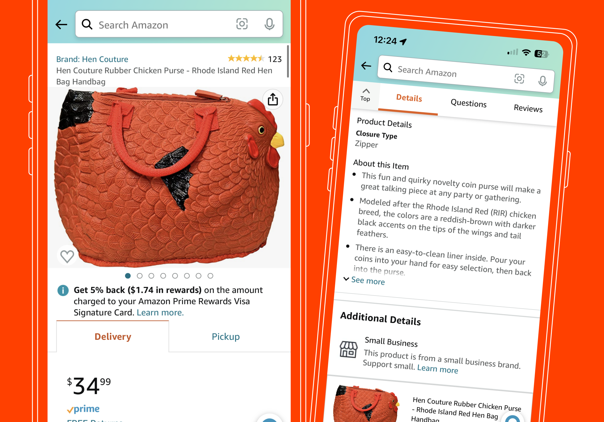
Enhanced visual product info on Amazon’s detail page
Redesigned the Amazon detail page to bring visuals to the forefront, introducing immersive vertical reels and layered product details. Experiments drove $282M in revenue and +9.1M units sold
-

Lightning deal visibility
Addressed customer frustration with missed Prime Day deals by improving deal timer visibility. The fix drove $167M in annualized revenue and earned an Amazon Empty Desk Award nomination.