Designing at scale, one token at a time
Varsity Tutors
design system
Leadership asked for a product that felt more alive. We answered with a design system built to change: a token foundation that let us repaint the whole learner experience with more color, energy and polish, and theme it for learners of different ages, without rebuilding components.
As Design Manager for Varsity Tutors' consumer experiences. I set the visual and accessibility direction, partnered with product and engineering leads, and mentored a direct report who led the initiative end to end.
Problem
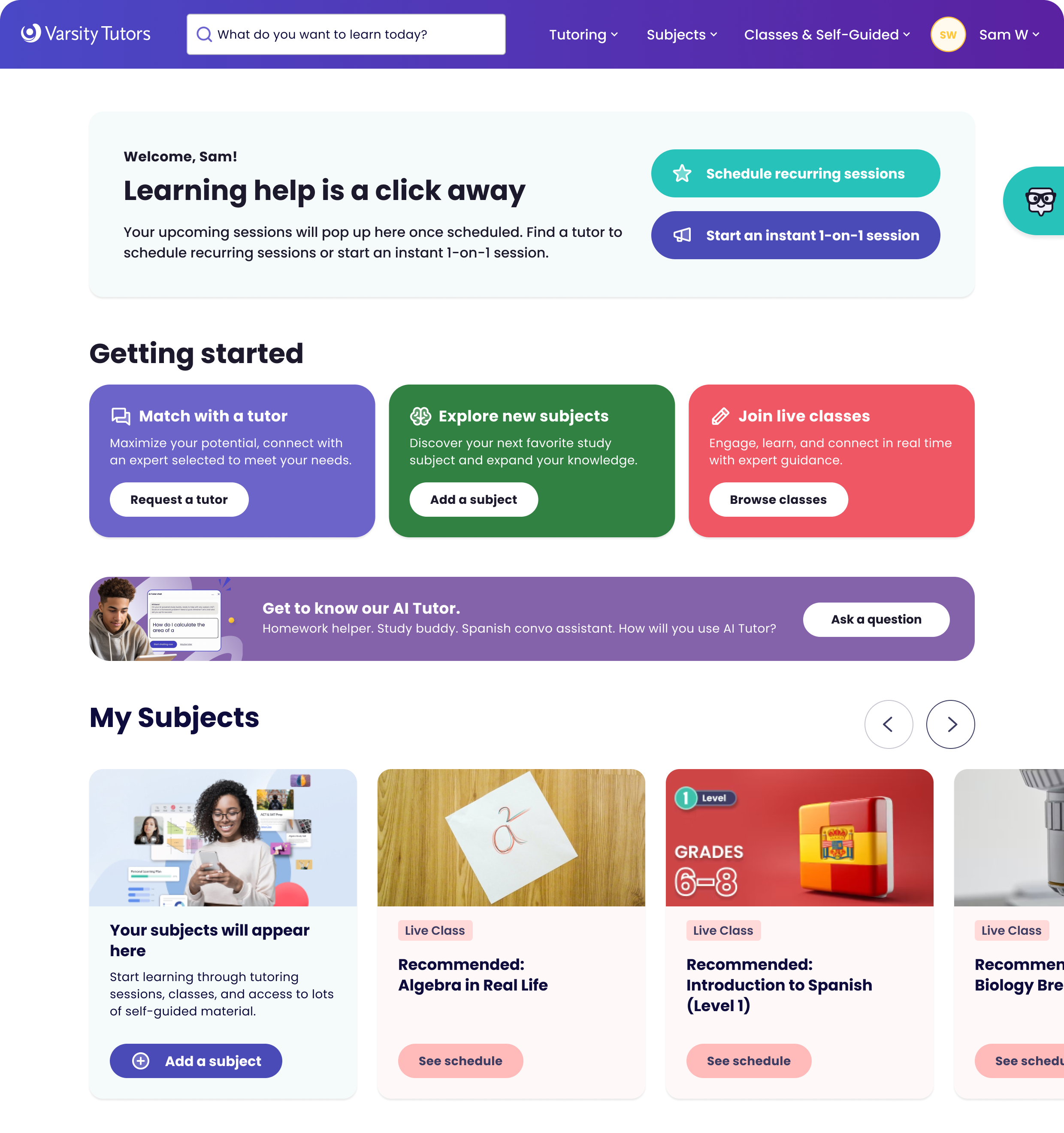
The system had inconsistent components, incomplete tokens and handoffs that varied by team. Engineers had no reliable source of truth, so visual drift crept into production, and designers spent time styling from scratch or fixing overrides. On screen, the result was an experience that often fell flat: pale quartz backgrounds, muted cards and few clear calls to action across sign-in, My Learning, My Tutors and My Schedule.
We were also boxed in by legacy systems. Deep changes to flows and functionality would take quarters, so we needed a way to add energy quickly.
My role
Design Manager, Consumer Experiences
Partnered with product and engineering leads across consumer and tutor verticals.
Mentored and empowered one of my reports to lead the initiative end-to-end, helping her establish process ownership, cross-team alignment, and documentation standards.
Directed visual direction and accessibility standards, ensuring color tokens and typography met WCAG contrast requirements.
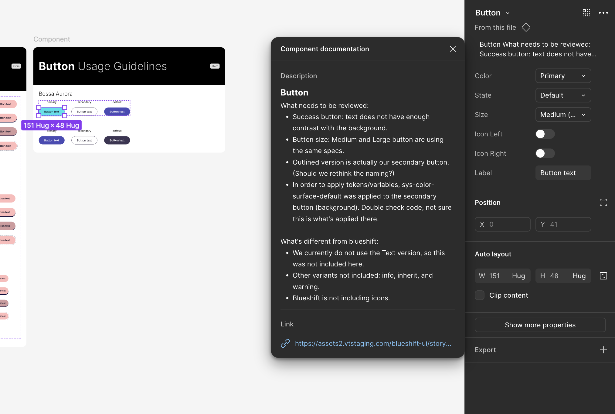
Led a lunch-and-learn for engineers on using Figma Dev Mode to bridge the gap between design intent and production accuracy.
Building the foundation
We fixed the system first, so that every visual change after it would cost less.
Audit and alignment: cataloged every component, variant and color token in use across verticals.
Foundations: built a token structure for color, typography and spacing, with palettes that met WCAG contrast requirements, plus a component architecture with clear naming and usage guidance.
Documentation: created a central system file and documentation hub with usage rules and accessibility specs.

Working with engineering
The biggest gap was between design and production, so we rebuilt how design and engineering worked together, not just the components.
A new handoff framework: built with engineering, with shared conventions for specs, versioning and redlines. Tokenized values and standard specs gave engineers something dependable to build from.
Review checkpoints: every new component had to pass both design and engineering validation before release.
Dev Mode training: a lunch-and-learn and a hands-on session introduced engineers to Figma Dev Mode, so design intent carried through to production.
QA checklist: a lightweight checklist for reviews after handoff caught drift before it shipped.
The result was fewer design review revisions, better production quality, and more trust between the teams through shared ownership.


Making it colorful and modern
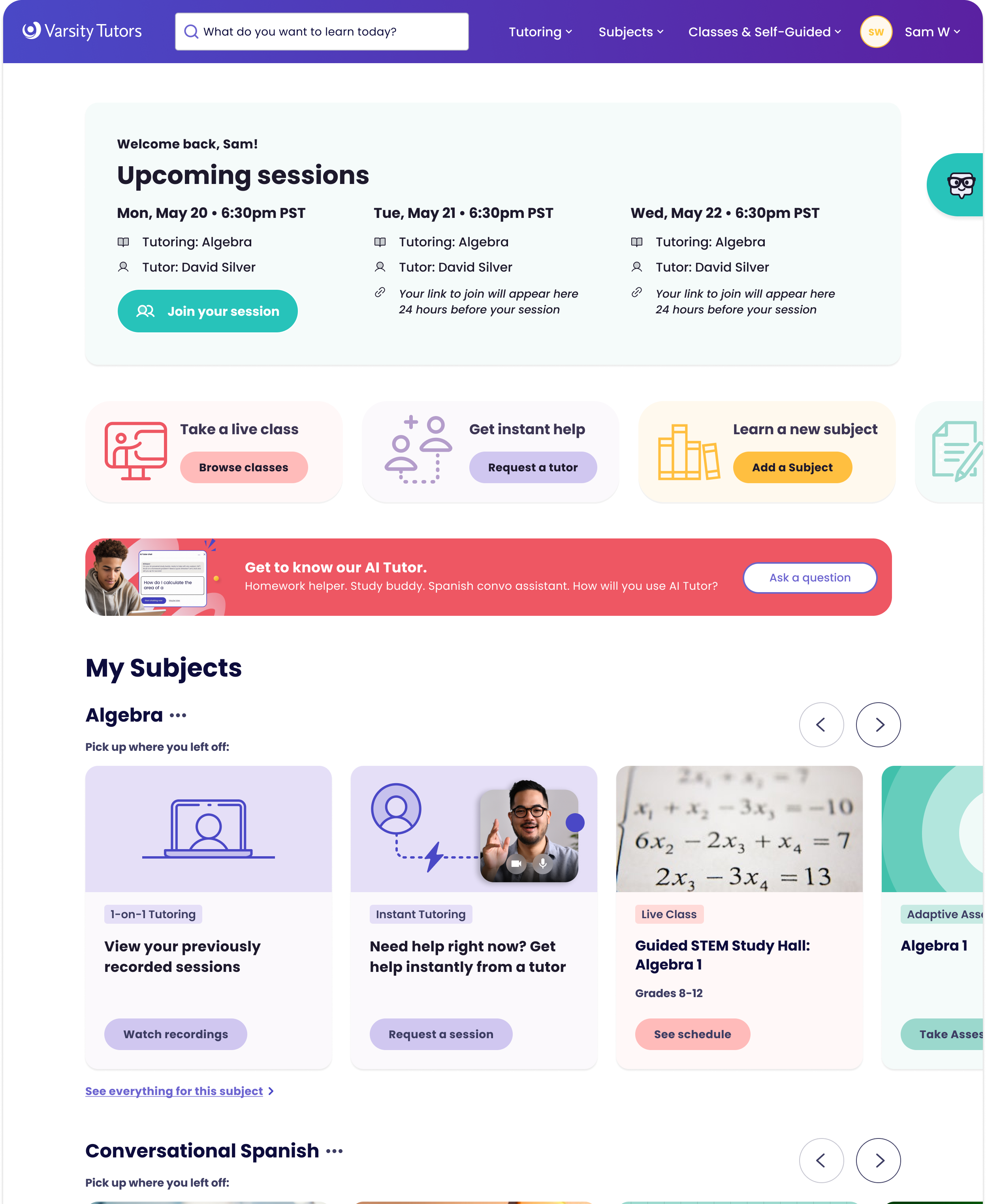
In May 2024 we took leadership two complete visual directions for the learner experience. Both were built almost entirely from token and component changes, so either one could ship without touching legacy functionality.
The plan had four parts: build on the new token system to change large parts of the product at once, pick the pages with the most room for visual impact, push promotional elements for key actions, and keep refining spot illustrations through dev handoff. We showed both themes across sign-in, the profile picker, My Learning, subject detail, My Tutors, My Schedule and dialogs, with the current experience beside each.
See deck presented to leadership here.
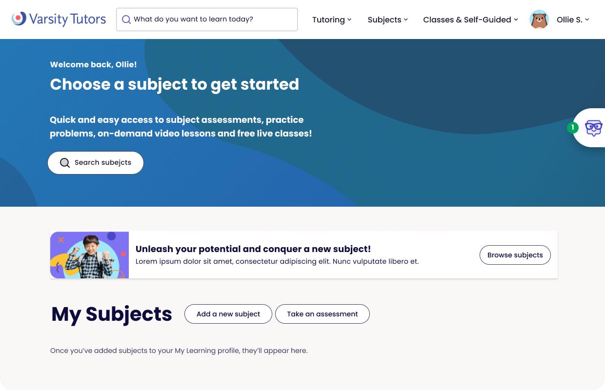
Previous UI
Themes for different age groups
Because every color, surface and button pulled from shared tokens, a theme became a set of token values, not a fork of the product. That let us tune the experience for learners of different ages while engineers kept a single component library.
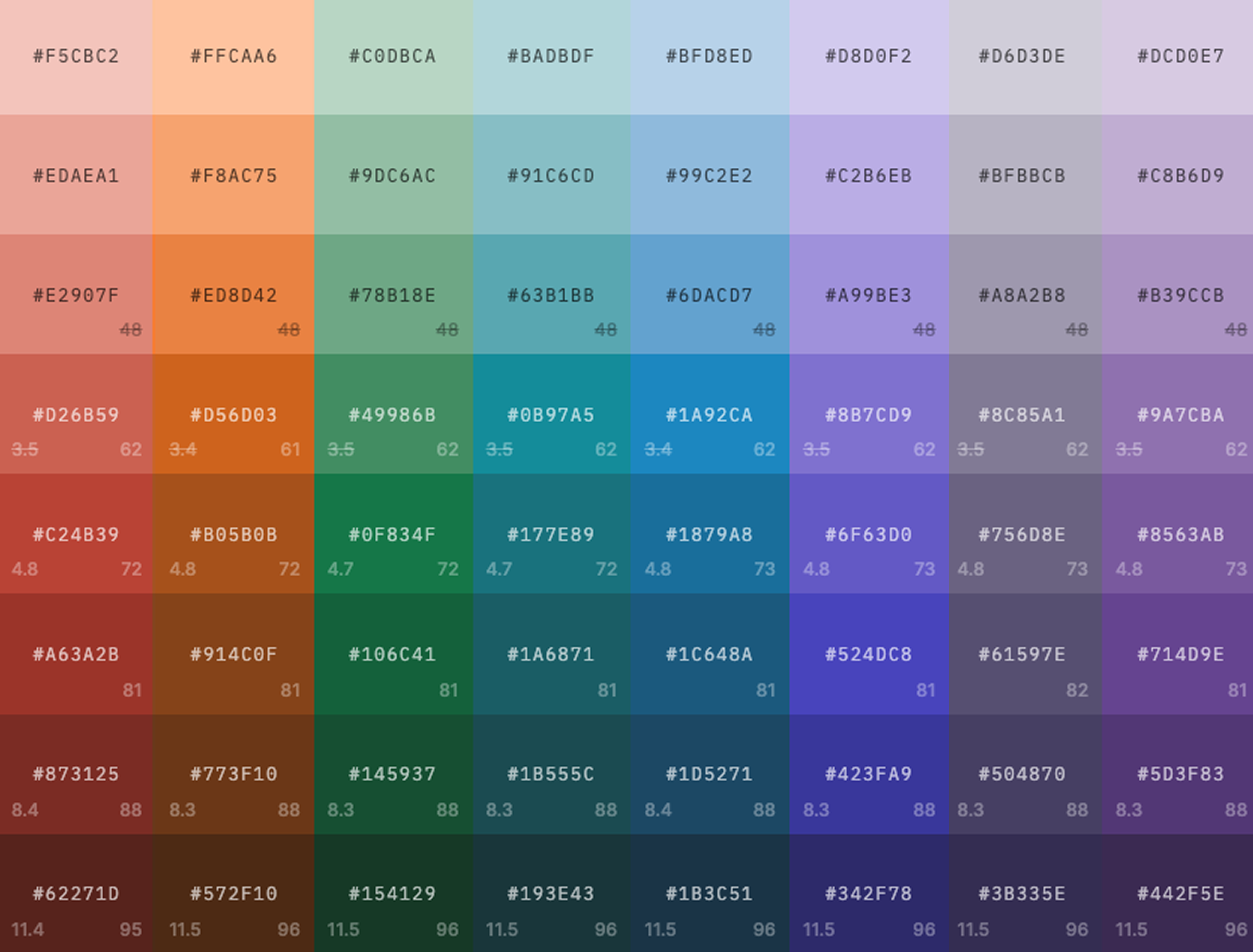
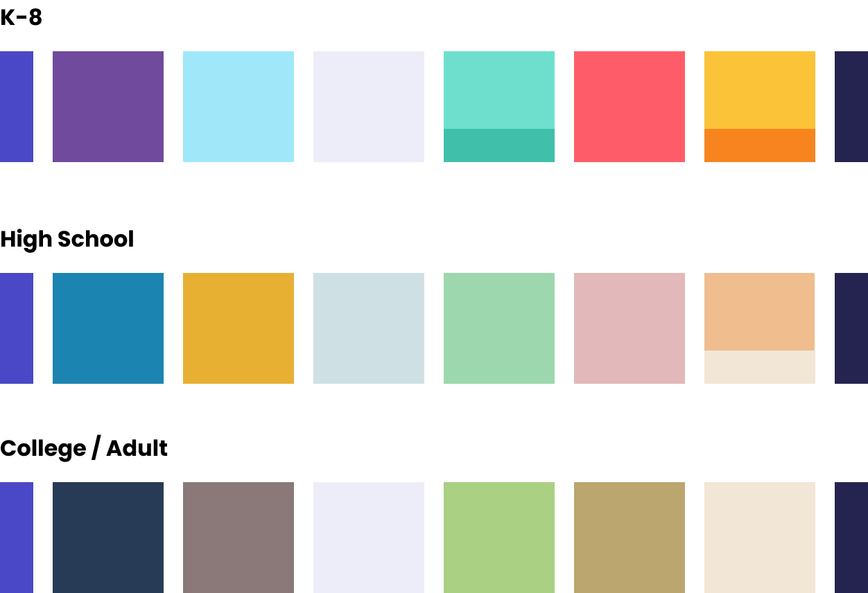
We defined three age-based palettes. Each one keeps the same brand indigo and deep navy at its edges, so every theme still reads as Varsity Tutors. The colors in between get calmer as learners get older.
K–8: bright and playful. Saturated purple, sky blue, mint and teal, coral red, and sunny yellow and orange.
High School: more grown-up, still with energy. Ocean blue, mustard gold, sage green, dusty rose and peach, on a soft blue-gray tint.
College / Adult: muted and earthy. Slate navy, warm taupe, soft green, khaki gold and cream.
Shared across all themes: brand anchors, components, layout, accessibility contrast rules and handoff specs.
Outcomes
Consistency and speed: designers could put screens together faster, with fewer custom overrides.
Confidence in implementation: engineers worked from tokenized values and standard specs.
A modernized, colorful UI: the refreshed visual foundation brought energy to the learner experience and supported the company's rebrand.
Themes for different audiences: the same components could serve different age groups through token-based themes.
Empowered team growth: my direct report gained experience leading cross-functional systems work and presenting outcomes to leadership.
Reflection
The visual refresh was the part people noticed, but the token foundation is what made it possible. Because the system was built to change, "make it more colorful" became a few weeks of work instead of a rebuild. Design systems depend as much on people and process as on visual craft.