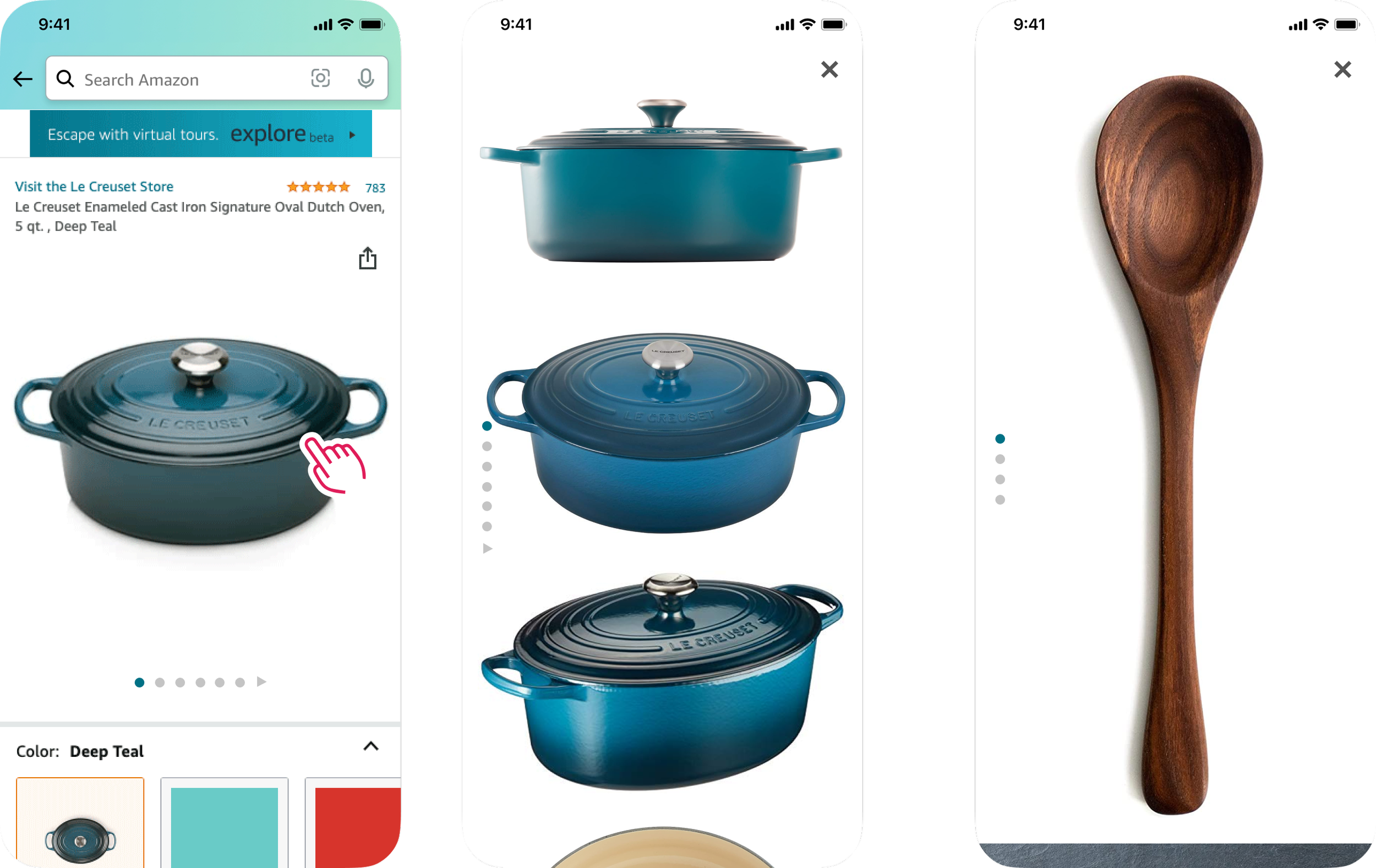
It’s all in the details
Enhanced Enhanced visual product info on Amazon’s detail page
Product Reel was a visual-first redesign of Amazon's mobile detail page: a vertically scrolling reel of media on the surface of the page, with product details layered in a pull-up sheet underneath.

4%
of customers swiped image carousel
5.2%
tapped into the full-screen image view
x12
more trust in customer photos than seller photos
+$433MM
revenue from simply adding an XL image size
Customer Problem
Research kept pointing the same way. Shoppers trust what they can see: packaging, real-life customer photos, rich brand content. Product photos were one of the features that gave customers the most confidence to buy, yet about half said competitors' photos did a better job.
Experiments agreed. Making images bigger won. A gallery of large, stacked images lower on the page won too, but customers were frustrated to see the same photos twice. Meanwhile the main image carousel was barely used.
Customers shop with their eyes. Our images were stuck in a carousel almost nobody swiped.
Across categories, the most useful information was often in the image, not the text.
The idea
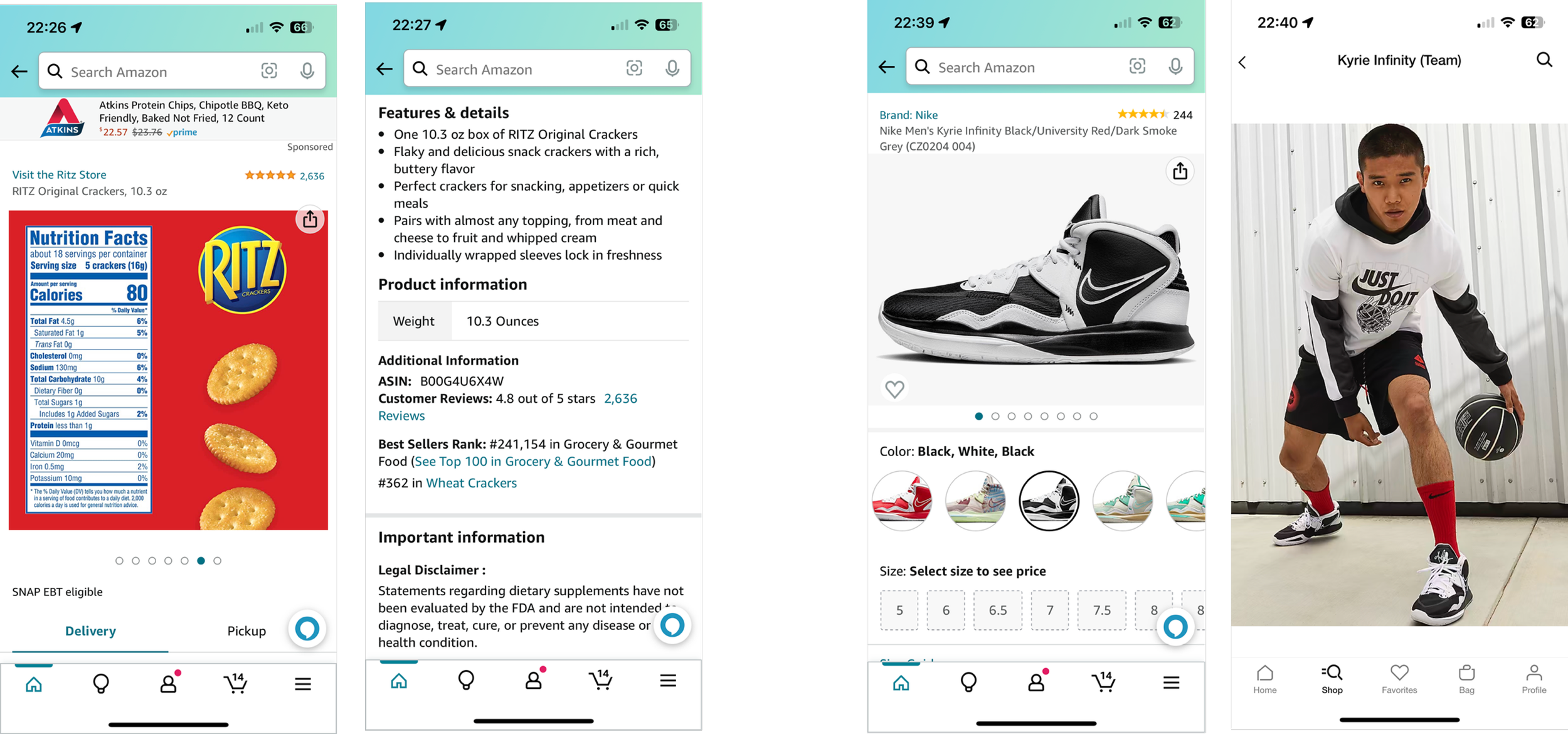
Learning from split
screens everywhere
Fashion retailers, marketplaces, maps and ride-hailing apps all solve the same problem: a big visual on top, details you can pull up from below. I studied how each one handles scroll, snap points and getting back to the top before committing to a model.
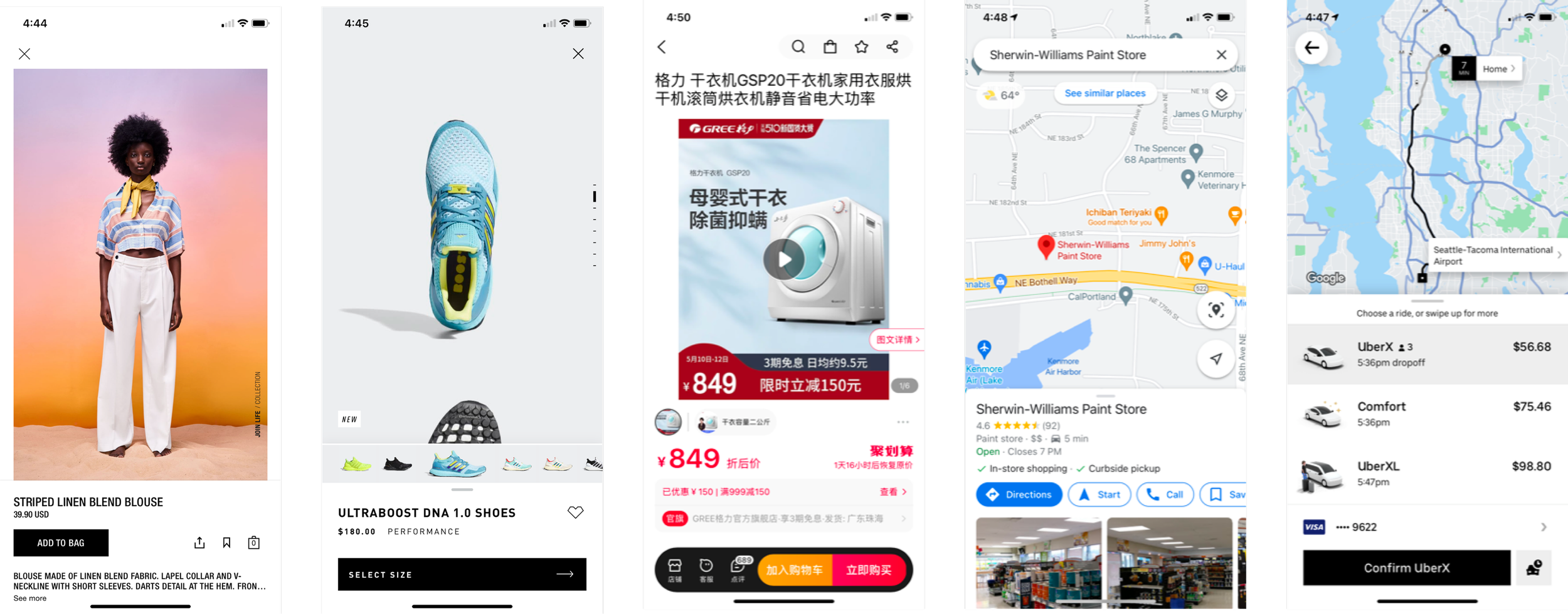
Split-screen patterns across other apps.
Solution
Two layers:
a reel to look, a sheet to decide
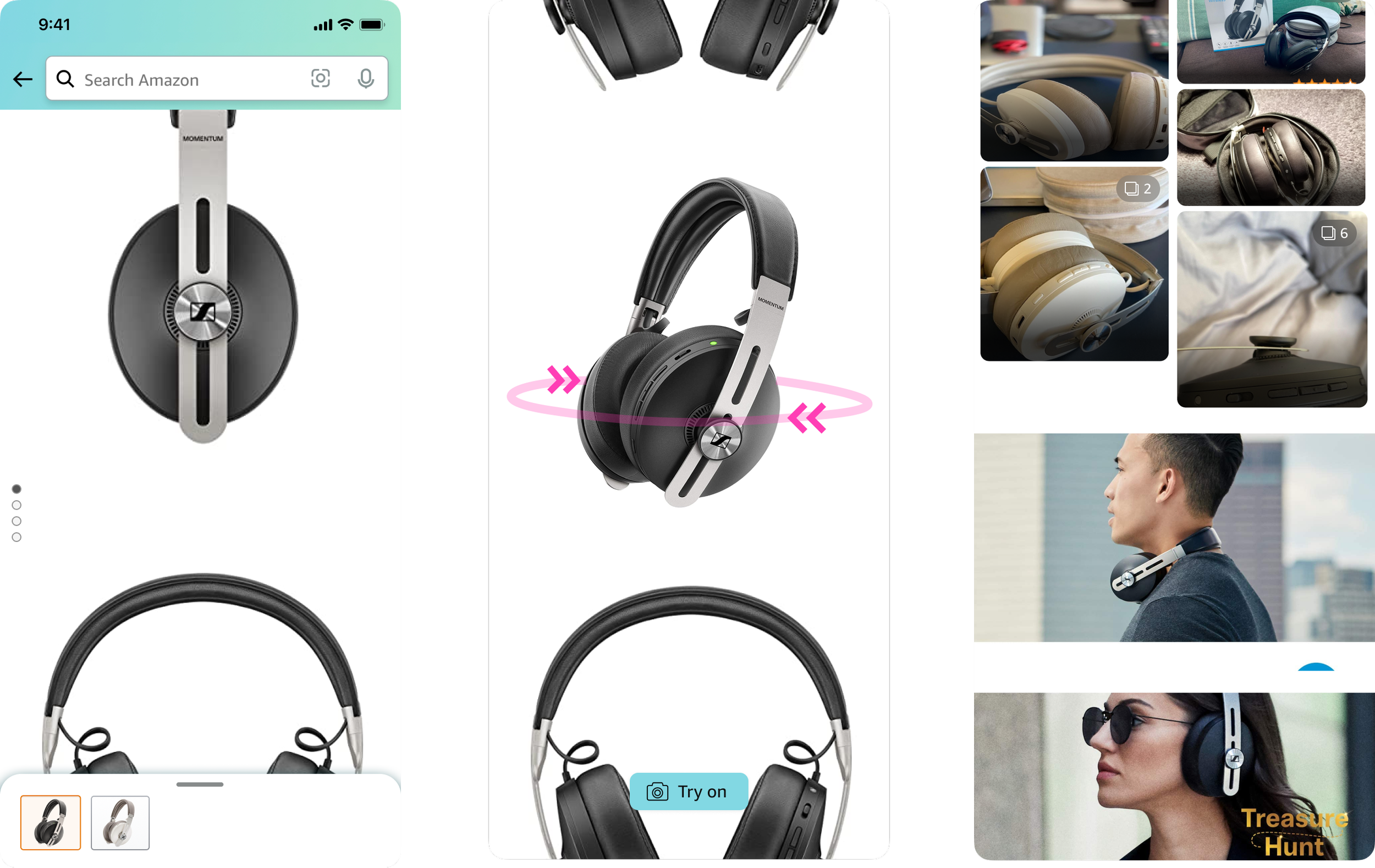
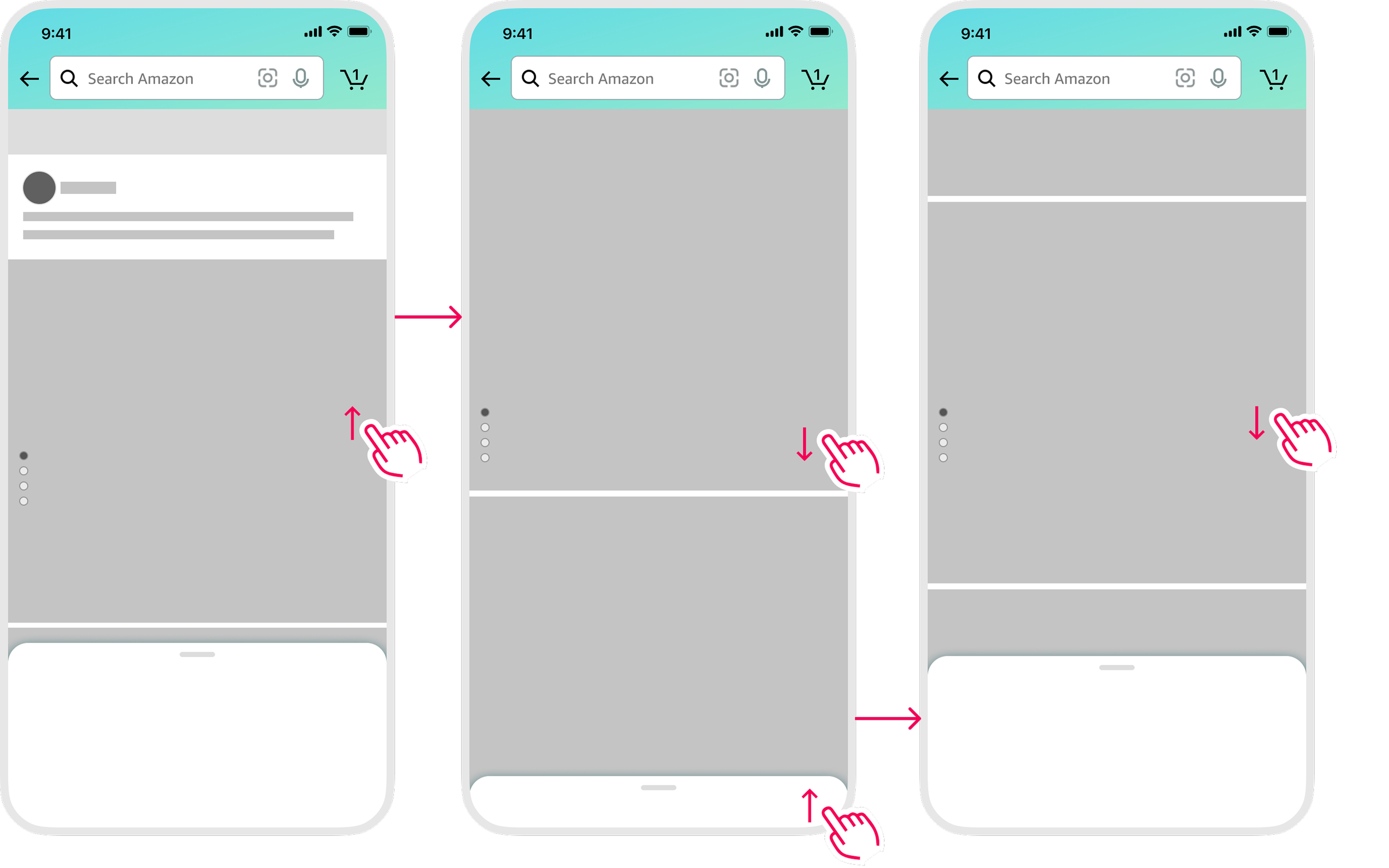
Instead of hiding the immersive view behind a tap, we brought it onto the surface of the page. The reel is a vertically scrolling space for every kind of media. The pull sheet holds the deeper evaluation: product information, offers and recommendations.
Layering meant we could give images far more room without duplicating content or making an already long page longer. It also gave us a home for new media: creator and community content, same-brand navigation and brand skins.
Solution
Mapping the
end-to-end model
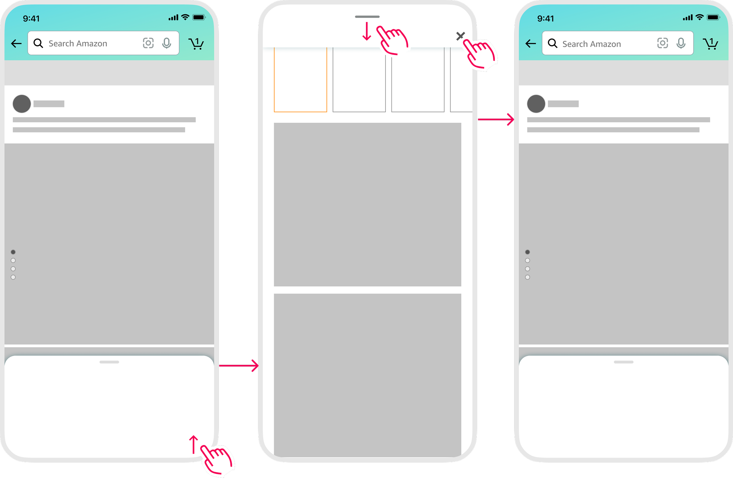
I worked the gestures out in wireframes first: swipe up to pull the sheet, scroll the reel, pull down to dismiss. Then in high fidelity, where the real tension showed up. Shoppers flip between colors and sizes constantly, so variation swatches had to stay connected to the images they change.
Testing and usability
Three rounds of evidence
I designed smaller, incremental changes to product imagery, both proving that larger, more scannable visuals increased engagement. Building on these learnings, I guided the design team in creating new prototypes for a vertically scrolling, media-rich product experience that unified these behaviors into a cohesive “Reel,” which I ran usability on.
A/B Testing
We first tested vertical scrolling inside the existing full-screen image view. It clearly helped people evaluate products: +$282MM revenue and +9.1MM units. But it cost sponsored-product revenue, so composite revenue came in at -$19MM and it missed launch criteria.
Usability
Nearly every participant navigated both prototypes with almost no prompting, starting in the images and moving into the details on their own. Nearly all preferred the full-screen details version, and they loved Buy Now and Add to Cart following them as they scrolled.
Beta
Real shopping exposed some issues. Splitting images and options into separate layers broke the "pick a size, flip through colors" habit, and collapsing images on scroll felt like a bug.